SITEHUB
SITEHUB
CONSOLE PAGE UI ENHANCEMENTS
*The visual identity has been modified, and the data has been blurred to ensure client confidentiality.
The Portal Application is a comprehensive data management platform designed to streamline benefit calculation and evaluation processes through a suite of robust tools.
This design analysis focuses on the Console page, aiming to identify UI inconsistencies, evaluate compliance with Section 508 accessibility standards, and improve the overall aesthetics and functionality.
BEFORE:
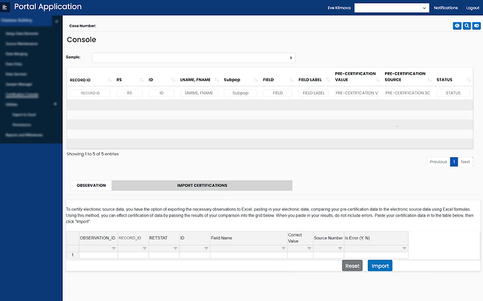
Key findings and opportunities for improvement include:
-
Inconsistent Table Styling: The two tables on the page feature differing styles in terms of color, font, text alignment, and sorting/filtering options, leading to a disjointed user experience.
-
Accessibility Issues: The color contrast of sorting icons and text within filtering boxes is insufficient, failing to meet the recommended 4.5:1 accessibility ratio.
-
Tab Styling: The visual design of the tabs lacks cohesion and requires refinement for better usability.
-
Instructional Text Readability: The paragraph above the second table is not easily readable due to inadequate left margin. This text should be more distinguishable as instructional content to guide users effectively.
-
Button Placement: The "Reset" and "Import" buttons are misplaced at the bottom of the page, disrupting the visual hierarchy and usability.
-
Inactive Button States: The "Import" button is currently active, even when no items in the table are selected. This behavior needs to be corrected to prevent user errors.
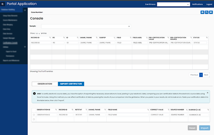
AFTER: